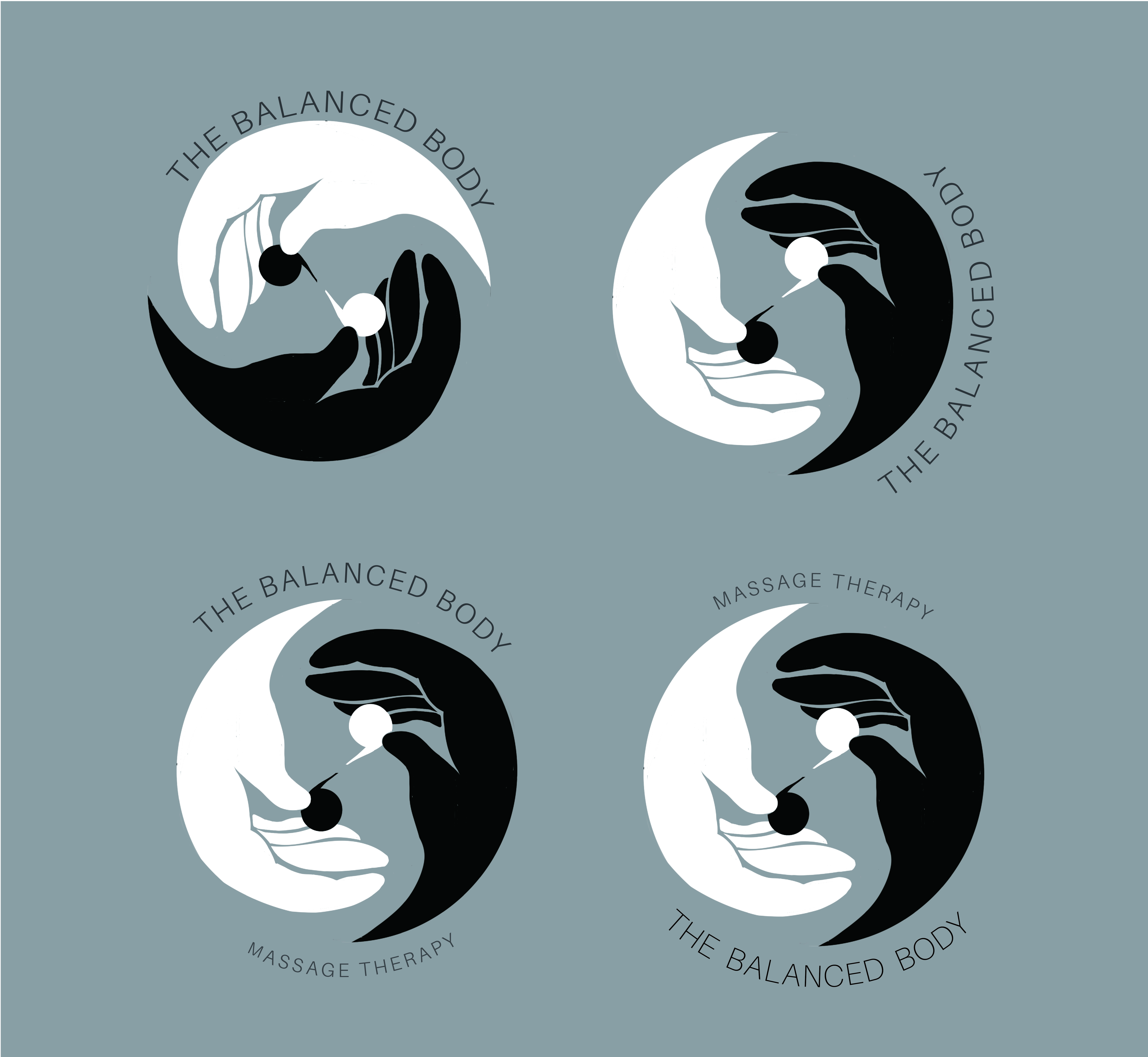
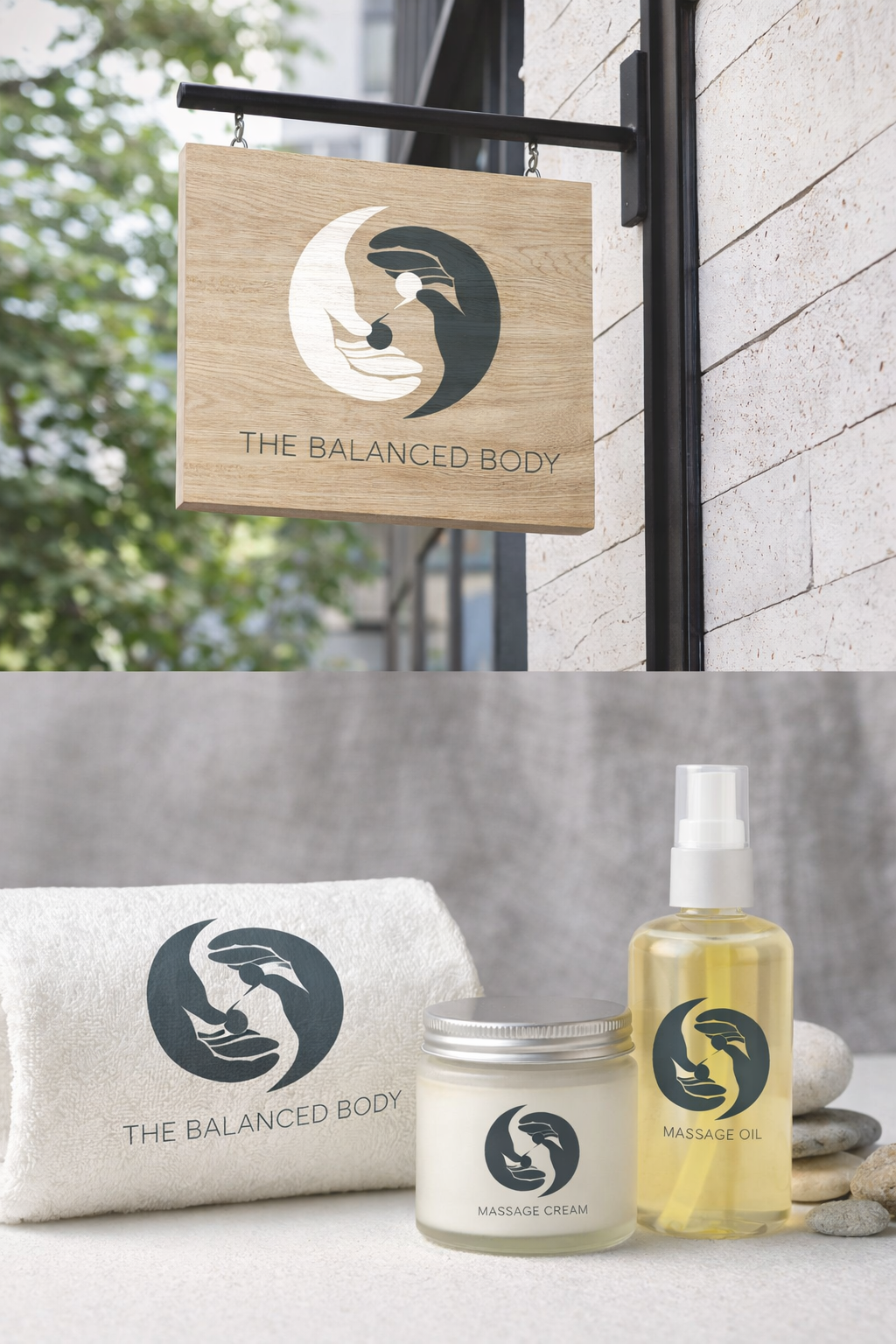
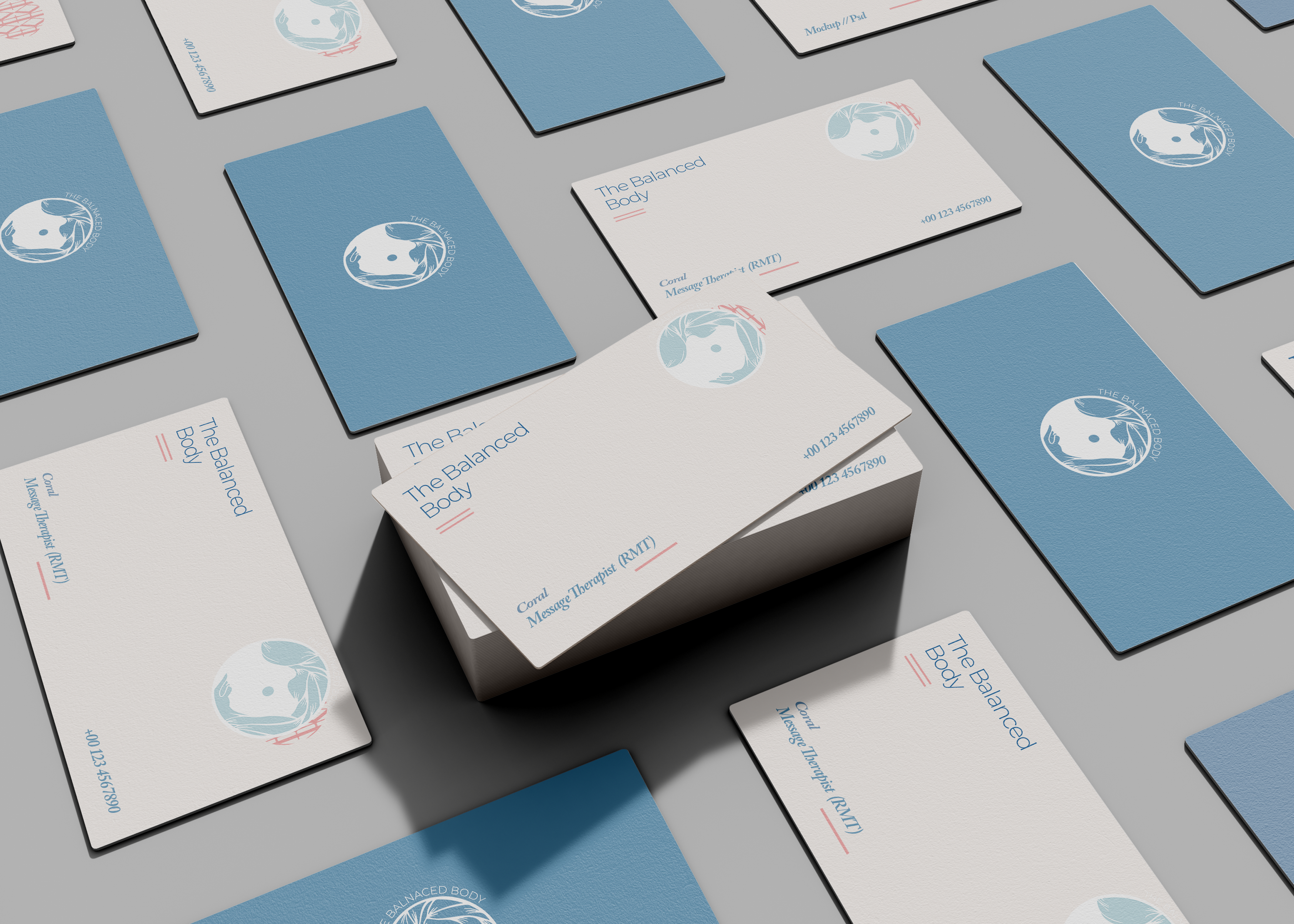
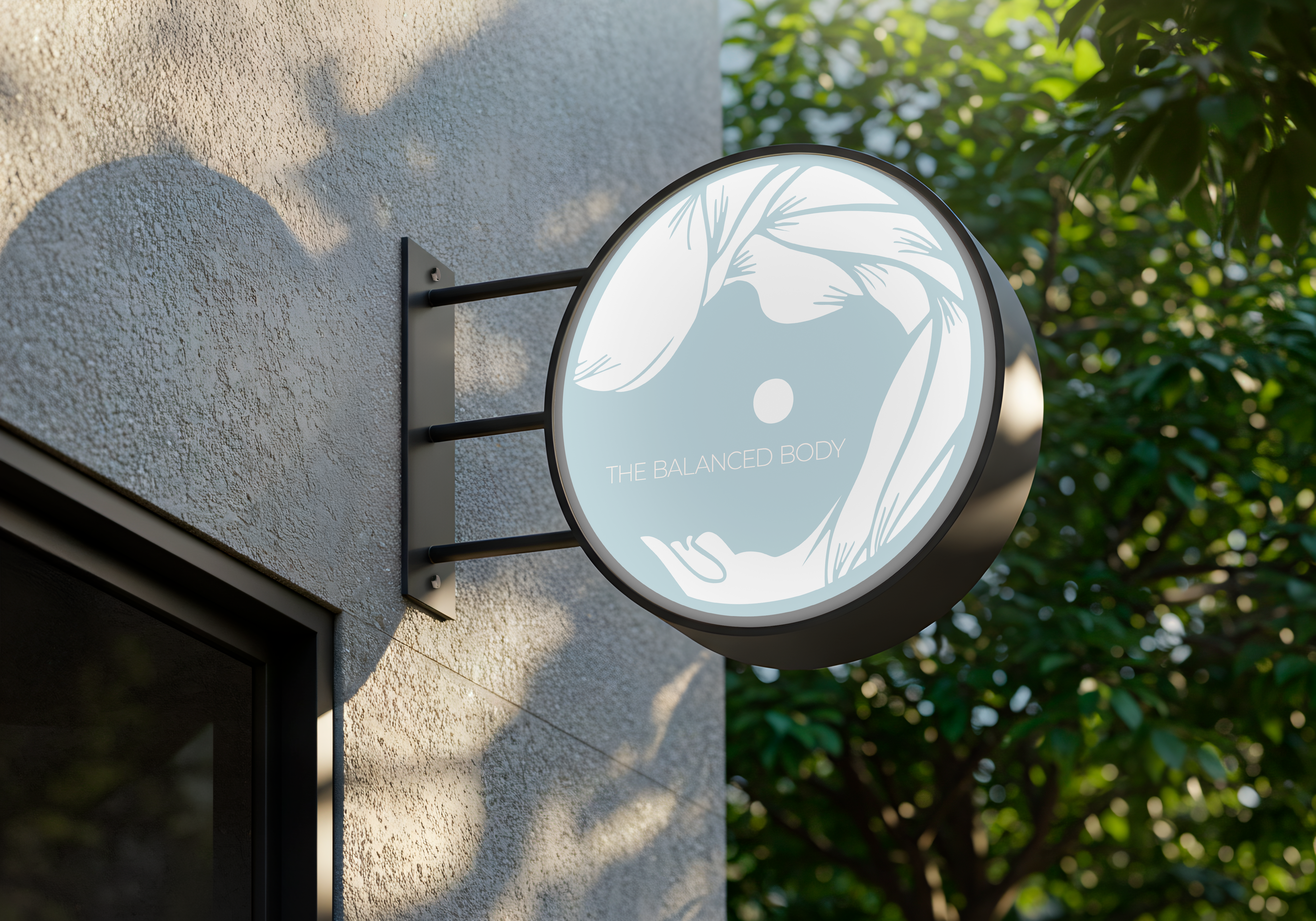
The Balanced Body was a collaboration with an entrepreneur launching a massage therapy clinic in Ontario. She initially had a complex logo centered on the yin-yang concept and wanted to reflect muscles and hands, symbolic of her services. The task was to simplify this intricate concept while preserving its meaning.
After multiple brainstorming sessions, a black-and-white palette was chosen to evoke the yin-yang philosophy. The final circular design features two hands forming the shape, conveying balance, care, and the supportive nature of massage. The hands in harmony mirror yin-yang while subtly suggesting the clinic's core offering — improving body wellness. Simplified punctuation-like yin-yang symbols in the center add cultural nuance. The result is both distinct and instantly recognizable.

Voices